The Boston Symphony Orchestra is a cultural hub that redefines classical music in the Boston metropolitan area. The strive of the BSO is to embrace diversity, inclusivity, and accessibility. With this rebrand, I wanted to ensure that this met those qualities by introducing a classical yet modern identity.
Concept Statement: To introduce a contemporary identity in a major cultural hub while also appreciating its historic roots.
Boston Symphony Orchestra Rebrand
Focus: Brand Identity, Out-Of-Home Advertising
Year: 2024
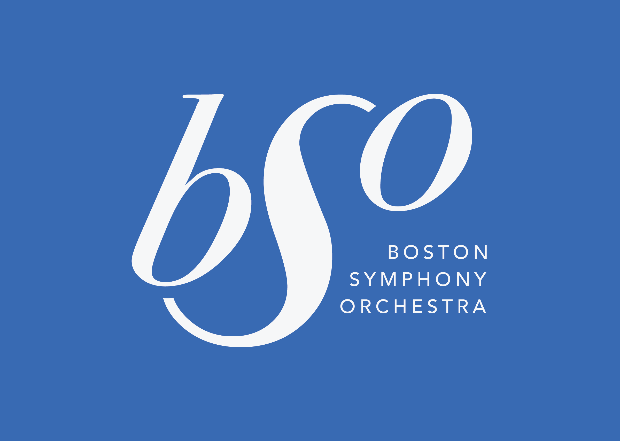
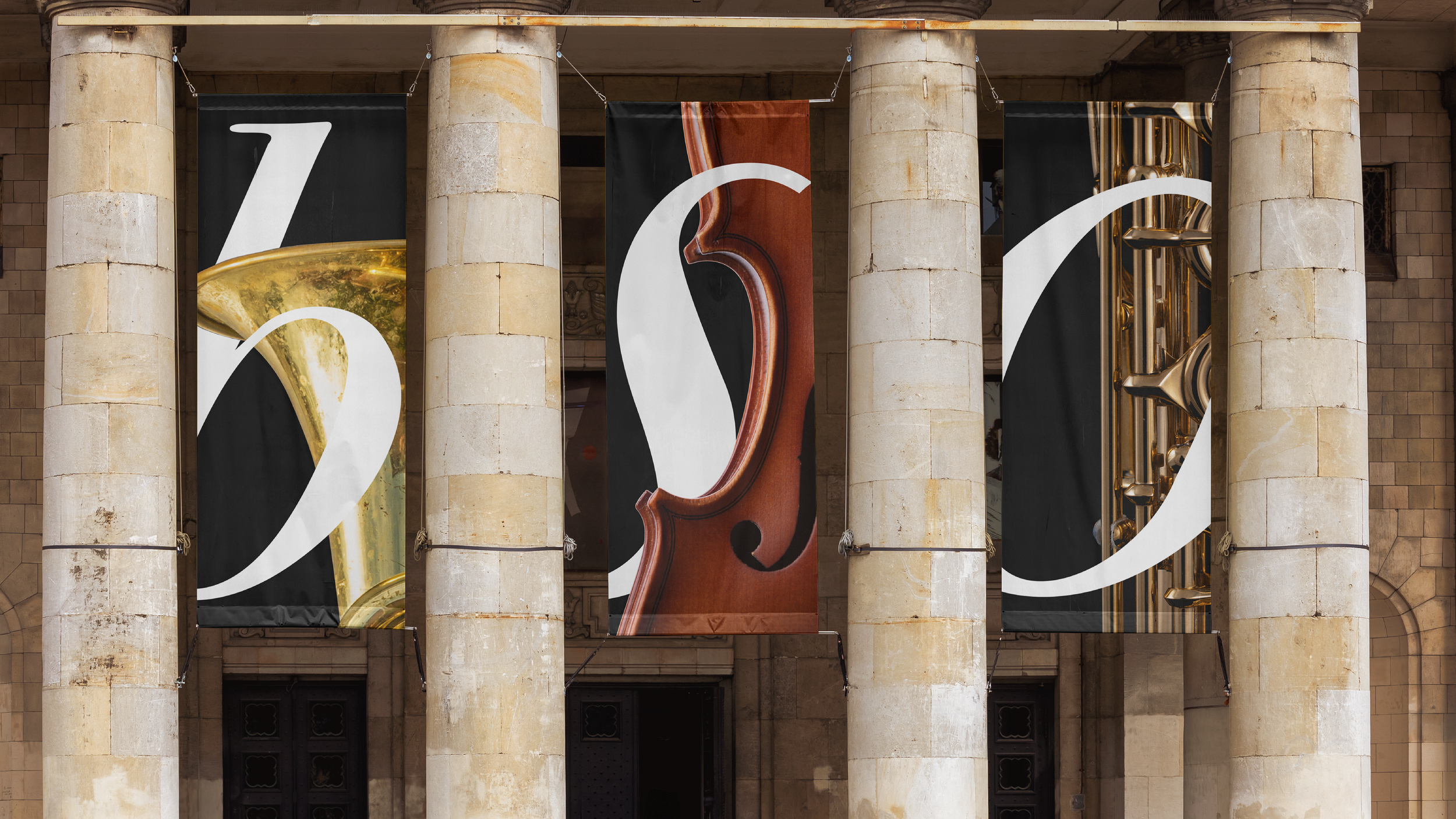
01 Logo Design
Inspired by music symbols such as the treble clef, I was interested in working with typography with a lot of my concepts and figuring out ways on how I can work with the letterforms to come up with a strong symbol I wanted my logo to feel modern but with a classical touch, in order to attract to all ages.

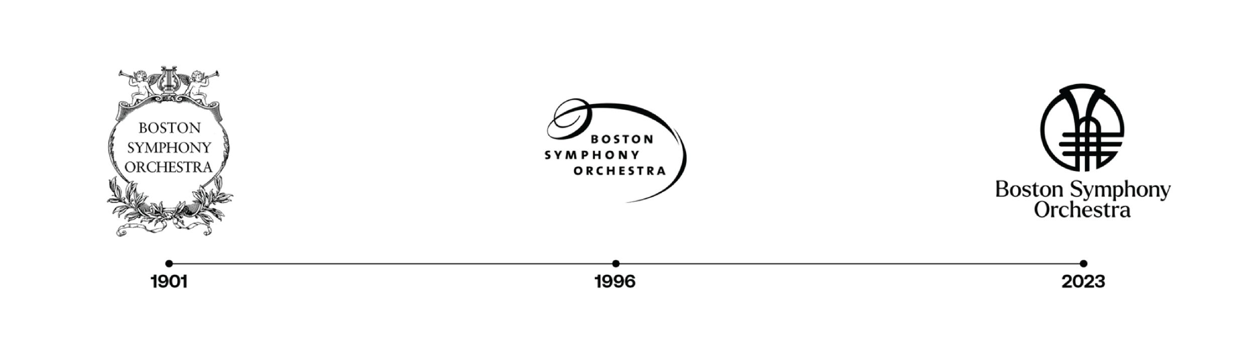
Logo History
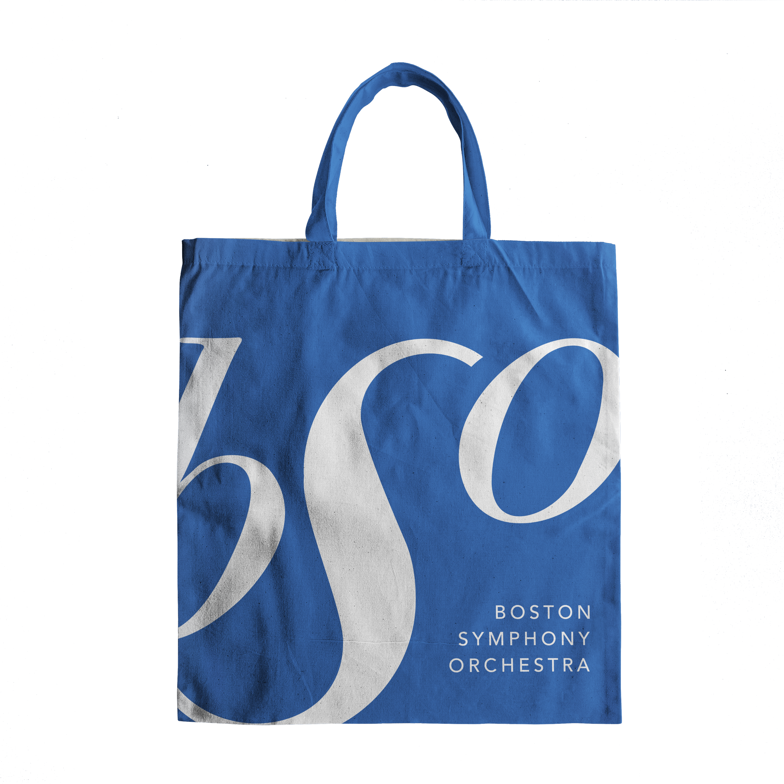
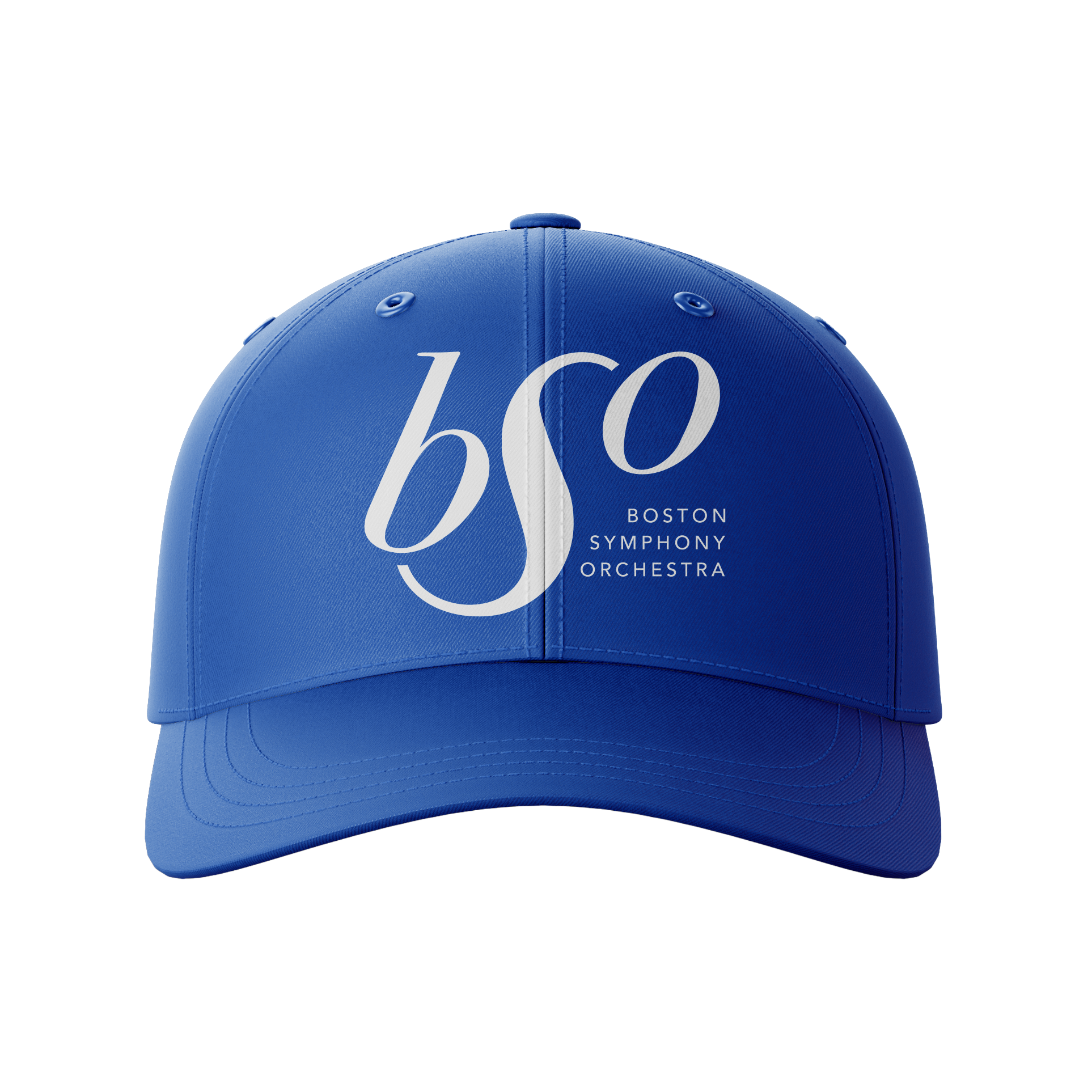
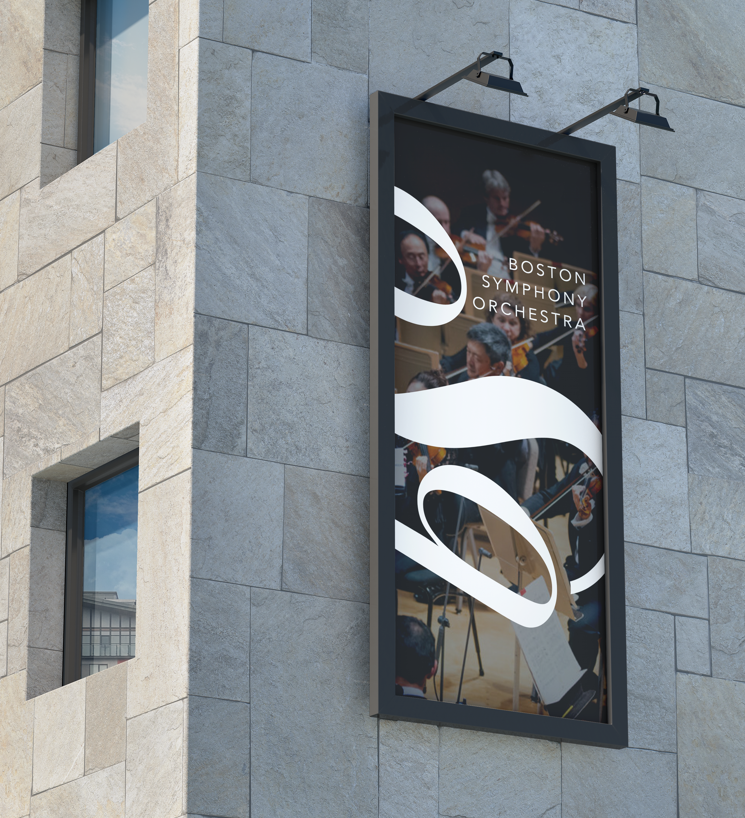

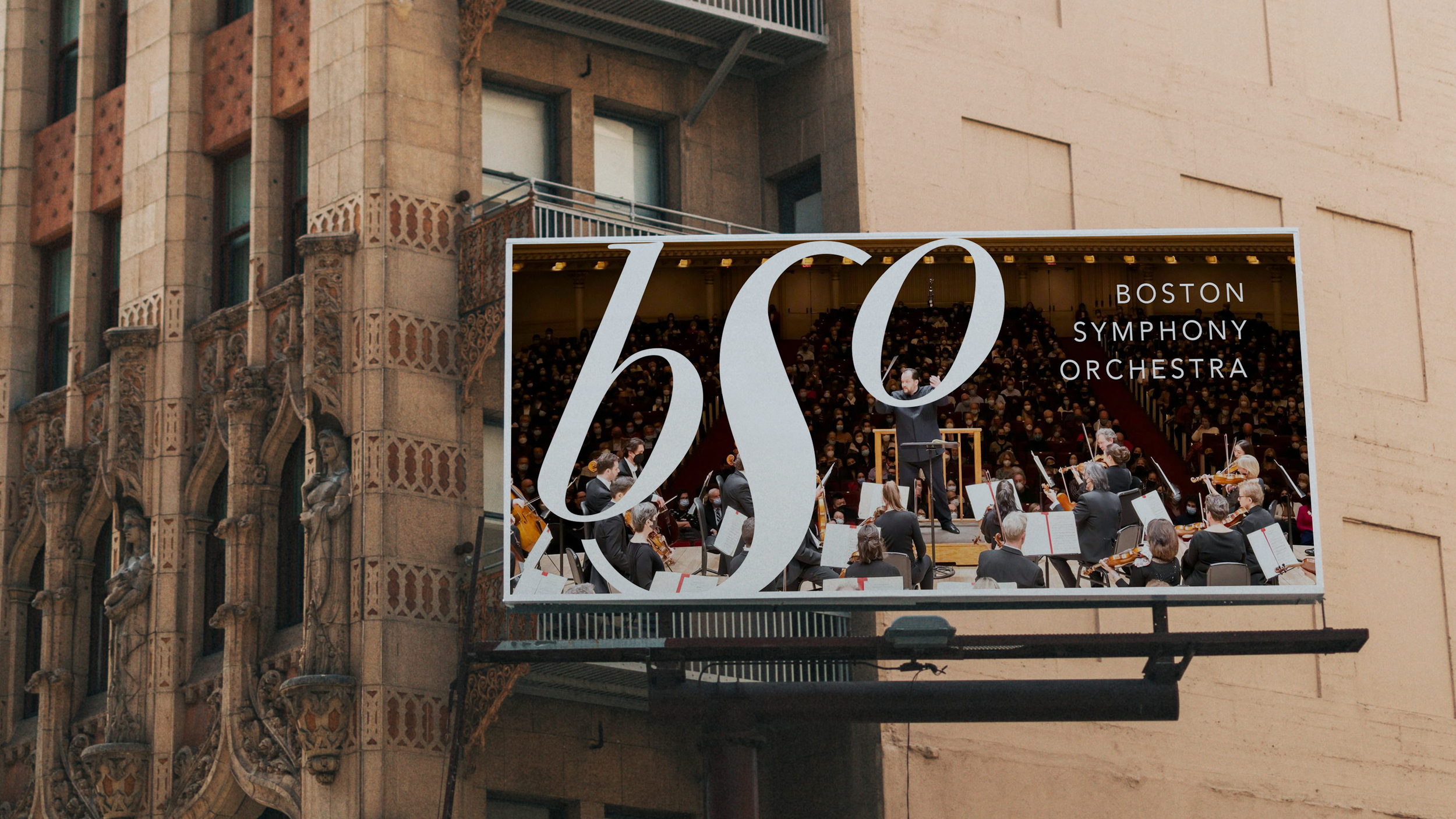
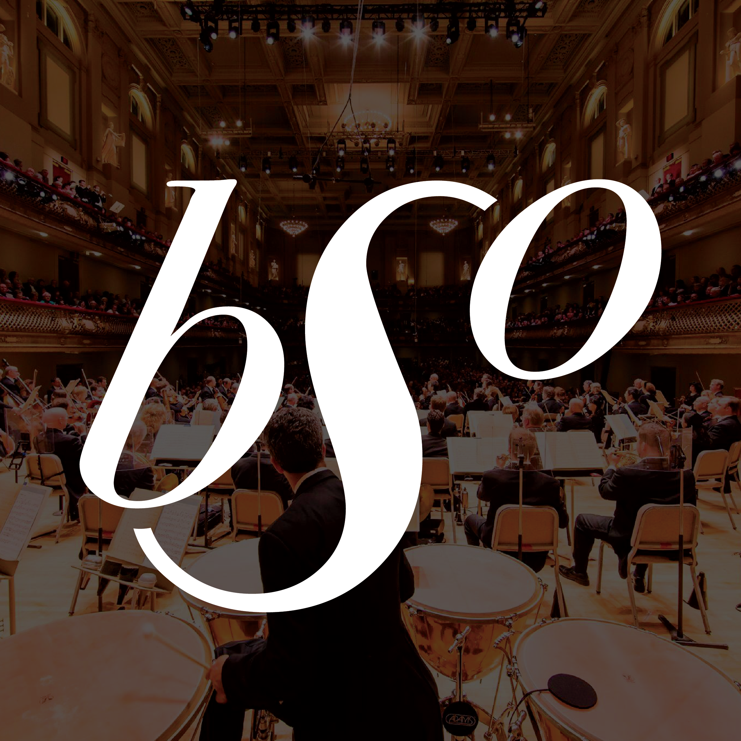
02 Applications
Using the logo design and brand assets, our visual identity seamlessly extends towards real world applications to ensure brand visibility.